
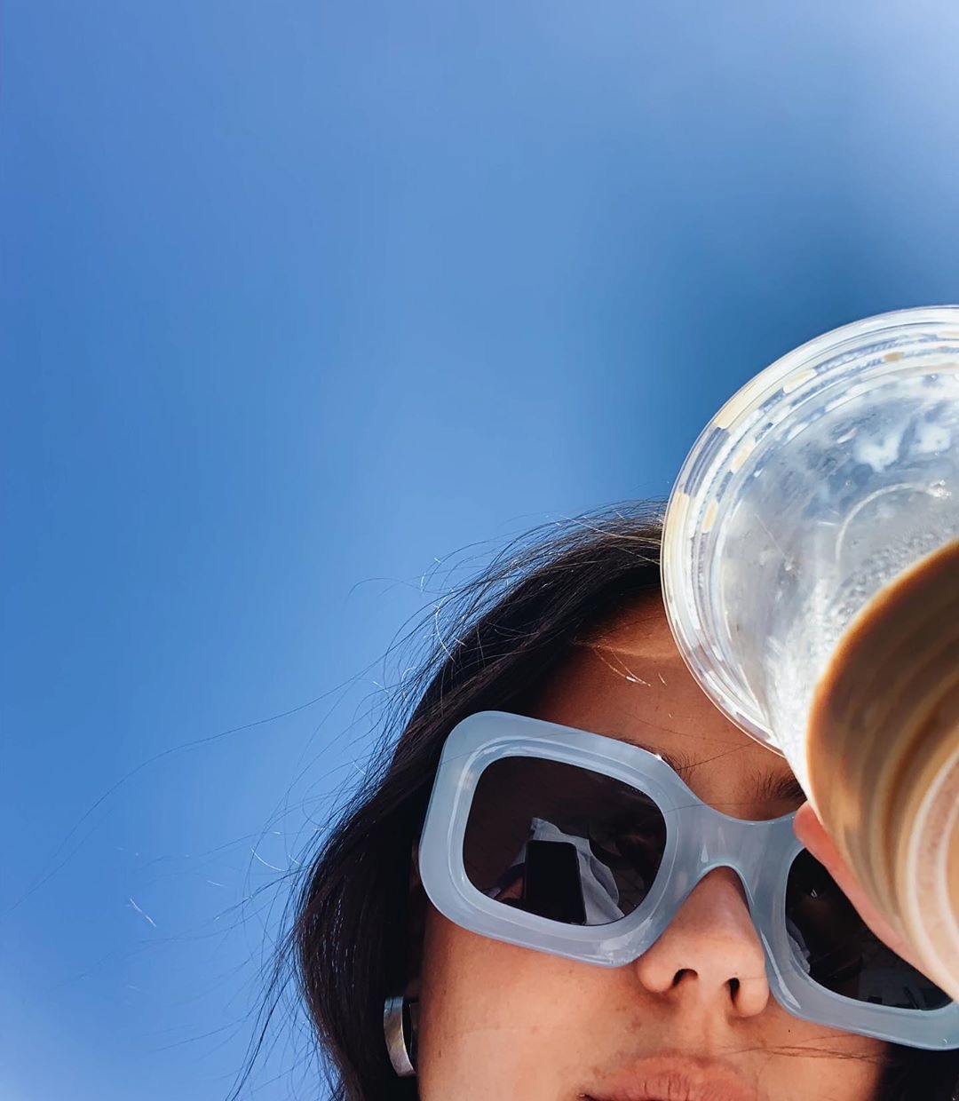
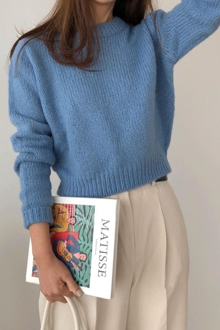
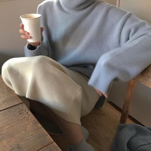
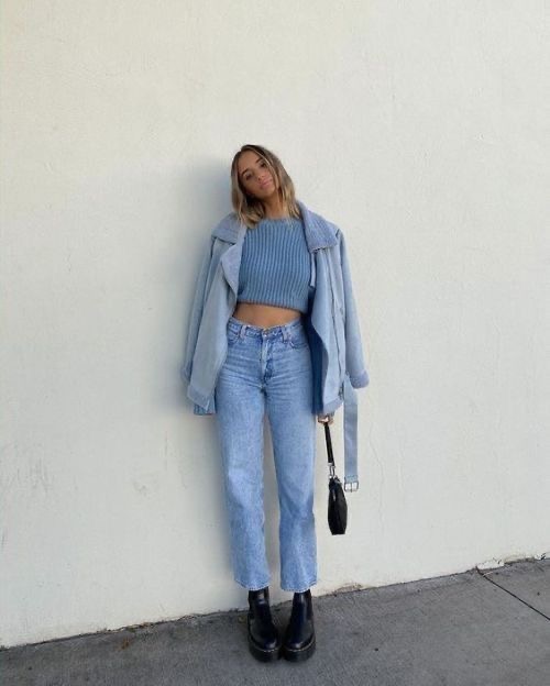
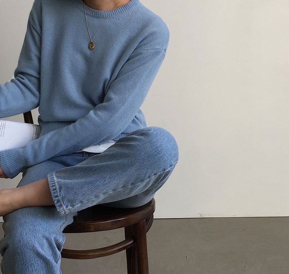
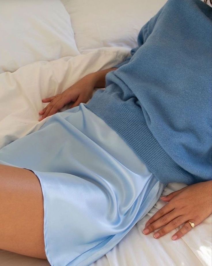
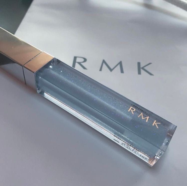
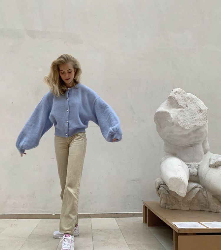
You can’t look at this color and tell me it doesn’t make you soooooo calm and soooooo happy. This is my favorite color and apparently it’s one of this season’s standout colors. Pantone described it as being “the color of the sky on a serene, crystal clear day” and i have to say i 100% agree. It’s peaceful, it’s cooling, and it’s simply a classic blue .
I’m taking a trend forecasting class right now and every so often my professor has us research predicted trends or past trends and collect some pictures to support. Sometimes we have to make a trend board and sometimes we simply collect our photos and upload them. I wanted to research Pantone’s predicted colors and this Cerulean Blue came up for THE SPRING/SUMMER 2021 NEW YORK COLOR PALETTE. I think it’s beautifullllll 🙂
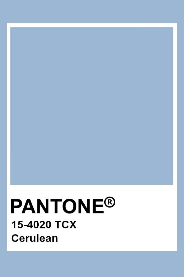


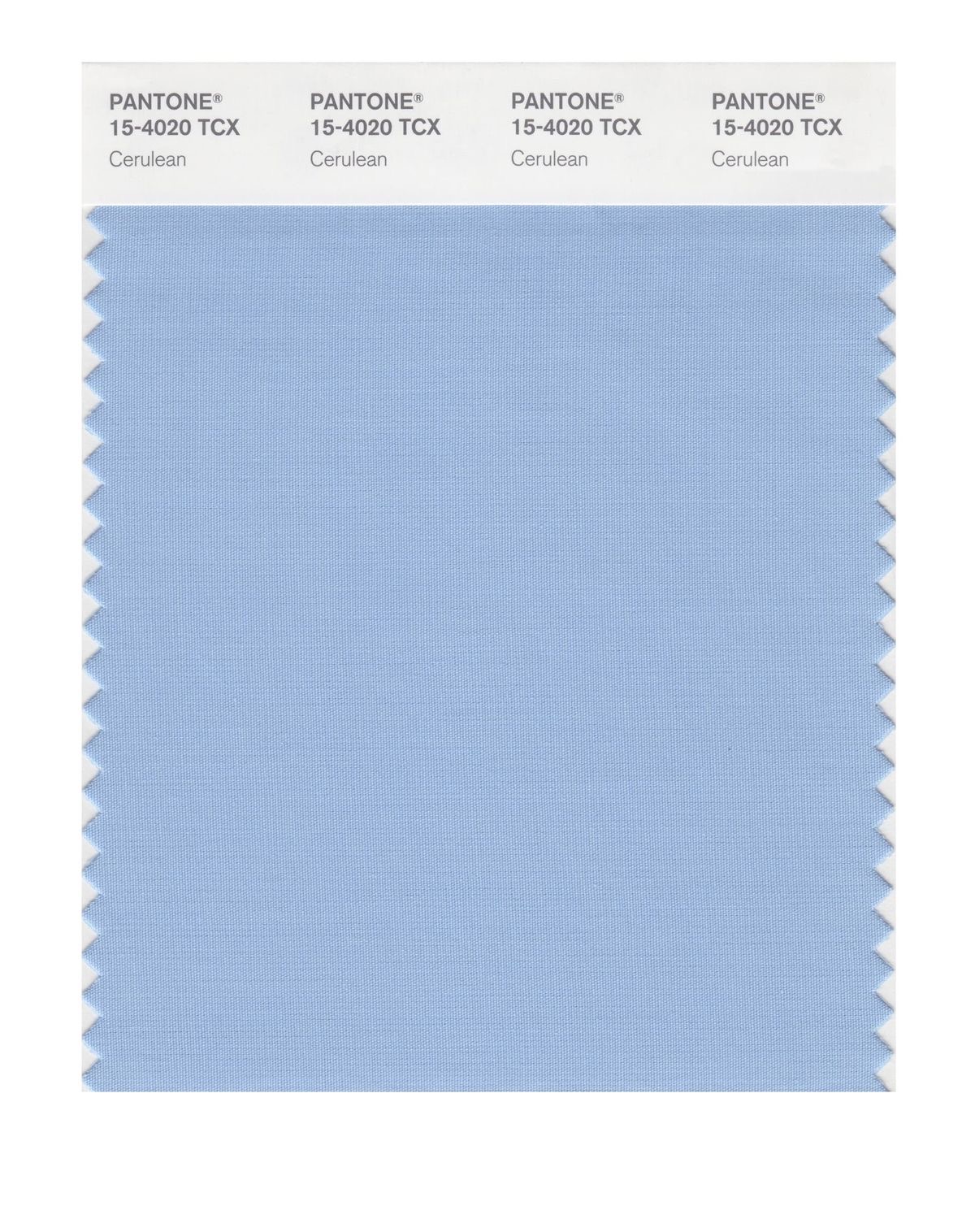


Link to the PANTONE website HERE to read more on the “Fashion Color Trend Report: New York Fashion Week Spring/Summer 2021”

Ooh this colour is good for the soul 🥰
LikeLiked by 1 person
It’s my absolute favorite!
LikeLiked by 1 person